Esse conteúdo é para você que quer mergulhar fundo nas habilidades profissionais e se destacar no mercado.
Design a database-style website that is as visually interesting as it is intellectually informative.
Art Direction
Identity, web, & infograph design
Animation
Client communication
Developer handoff
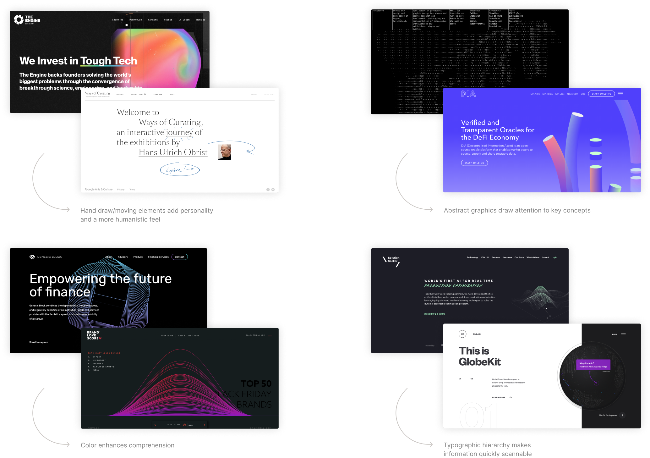
Initial research was conducted on similar database websites to gain empathy for users and understand what type of structure, layout, and functionality is typical of that type of site. We wanted to identify what worked and what didn’t in order to design a better experience.
O nome "Stageum" reflete a importância do primeiro estágio, onde tudo começa. Acreditamos que a otimização e o crescimento dos negócios têm início com um projeto de design impactante, capaz de fazer a diferença.
No cerne do nosso trabalho está o entendimento profundo do primeiro estágio, que envolve colaboração e esforços conjuntos na construção de um sistema de Brand Design. Este sistema não apenas diferencia as marcas, mas também aprimora significativamente a visibilidade e a percepção digital junto ao público-alvo.
Na Stageum, assumimos como missão a execução exemplar desse primeiro estágio de mudança e transformação. Buscamos não apenas atender, mas superar as expectativas, visando alcançar melhorias substanciais e resultados significativos para nossos clientes. Nossa dedicação é evidente na busca incessante pela excelência, destacando-nos como parceiros estratégicos na jornada de crescimento e sucesso de cada negócio que escolhe trilhar conosco o caminho do design digital e da construção de uma marca forte e impactante.

We also studied how other websites approached data heavy topics to determine how/if design treatment impacted our ability to understand the data being presented.
We simplified the site's initial structure by combining similar information onto single pages and renamed menu items to make the navigation more intuitive.

We knew from our research that the survey overview and individual survey pages were where drop off could occur. We explored a variety of layouts for those two pages in wireframes to determine which type of layout would create an easy and engaging user experience.

SciOPS design system aims to make complex information approachable and beautiful. This is achieved through the use of more humanistic elements, such as a serifed typeface and organic animated graphics that infuse the site with life and personality.
The SciOPS logo blends visuals from data and science to represent the vast amount of information collected to bring forth a unified consensus.
Two contrasting typefaces were chosen for both their aesthetic appeal and readability at small scales.

The color palette was derived from ASU’s secondary palette with the hues adjusted to reflect a more sophisticated approach.

For the infograph design, we decided to opt for a style that was minimal yet colorful. Oversized numbers were added to make the graphic quickly scannable.


Three icons were designed and animated to visually represent the process that the SciOPS follows to collect, analyze and share their data.

A photo specific treatment was developed and used on key images throughout the site to create a distinct visual style for the site and darken images so that text could be added on top.

By focusing on the quality of information instead of the quantity and approaching the design and UX with careful consideration of the end user, we were able to design a website that makes discovering and understanding the scientific community's opinion on relevant issues a straightforward and engaging experience.


